top of page


GOEAT
Have you experienced a time that you were hungry, but have to wait for the lines, wait for your waitress, wait for your dishes, wait for.... Okay, the lists go on. This is why I designed GoEat to create seamless dine out experience using mobile phone. You could use the GoEat to explore the menu, order foods, reserve tables, pay for the bills or even tell the restaurants when you'll arrive, so you don't have to wait. You will just need to be here, and ENJOY!
PROJECT OVERVIEW
Duration: 3 months
Independent project
PROCESS
Contextual Observation/Inquiry - Survey - Data Analysis (Affinity Diagram, Sequence Model) - Problem Space - Ideation - User Flow - Wireframe - Usability Test - Final Design
How I approached to the problem?
I always feel dine out experience is not as good as I imagine, there're lots of unexpected things could ruin my mood for exploring good foods/restaurants like I need to wait for 1 hour to be seated or the foods are not so tasty as I expected from the reviews I read online ... Having the empathy, I started to think why not design something to make this dine out experience pleasant without any breakdowns?
Here's how I approach the problem space:

Contextual Interview/Inquiry

Survey
I conducted contextual interview/inquiry with 2 participants and survey with another 4 participants. Field research helped me to observe and probe questions in-depth. The survey confirmed my assumptions and explored participants' needs and pain-points in a direct way.
Here's how I analyze the data:

Affinity Diagram

Sequence Model
I applied 2 qualitative data analysis based on their advantages. The affinity diagram helped me build information architecture from bottom to top clearly. The sequence model mapped out participants' journey to restaurants, also include their breakdowns to better help me keep an eye on the pain-points.
What exactly is the problem space?

1.Constanly waiting for....
Imagine you're so hungry, and you just want to seat and eat. Well, that's not the case in our shoes. One of the things I observed was the time we spent on waiting. Waiting to be seated, waiting for our server bring us water, waiting for her to come back and order, waiting for the dishes, waiting for the waitress to bring us the bills, waiting for her to bring back the receipts. Yeah, I know, I've already lost my patience here.

2. Can't find detailed information of specific food
You want to order "Shrimp & Chicken combo", but just want to check the reviews and pictures before ordering. But! You just can't! There are lots of photos without any title, you don't know which one is your shrimp & chicken combo, and there are lots of reviews, but it's just so hard to find one relates to that. The information are so overwhelming!

3. Different personal tastes leads to unexpected experience
Have you ever been in a scenario that you read the review of the food which said "the food is not spicy at all", then you order it and taste. OH NO! It's super spicy...Or the reviewers said "This food is heaven, you gotta try this!", then it turns out it's not that much. You're so disappointed.
Design Goal
How can I create a seamless dine out experience which saves people time for waiting and enjoy the food as expected?
How I solved the problem?
Firstly, I started to idealize trade-off for each problem to have a broad view of the system
Based on my interview and observation, all the participants used the mobiles for planning actions. I narrowed down the application to mobile due to its portable, easy access features.
Feature 1: order & reserve before arrival
Users could order foods online by reviewing their menu, they could opt-in/out to pay for the bills, also telling the restaurants when they will arrive. It could save them time from waiting to be seated, waiting for the dishes and waiting for paying the bills.


Feature 2: articulate about personal taste
Articulating about personal taste would let the reviewers know the writers personal preference. In doing so, reviewers could better judge the reviews from different writers.
Feature 3: gather information from one place
When users access to specific food's information, usually they want to see the reviews about their desired foods to judge whether to order, all the reviews and pictures are included underneath, it will make it easier for users to gather information they need instead of looking for the whole sites.


Secondly, I created user flow to see how users interact within the system

Thirdly, applying user flow to detail the screens and tested it out!
Users gave positive feedbacks during the usability tests. The feature of showing personal tastes was valued most. But they also had confusions about some design.
1. Hard to find "menu" button
During the tests, I found the "menu" button was hard for users to identify, it took them a little bit effort to locate. So I changed the location of the "menu" button besides the pictures, where users normally want to explore pictures by swiping left, hence see the "menu" button.


2. "?" and "cart" button are too small to identify or touch
Also, participants said the "?" and "cart" buttons are too small for them to click and see it clearly. So I zoomed out the "?" buttons and replaced all the "cart" button to "+" & "-", once they add item, the "cart" button would pop out from the button, also shown the number of how many items they've ordered.


3. No personal tasted information on foods' review page.
While participants browsing through specific foods' reviews and pictures, there's not enough information for them to make the final call, because it doesn't offer personal taste information. So I added personal tastes information there.


4. Reminder of orders
After finishing ordering items, I asked participants to check his order information, he can't find it. Usually, the information is in "account" button, but there's nothing showed up after their check-out. That might be the reason the participants can't located where it was. Then I added motion features to the interface to give clear instructions of where their order information goes.


Final Design
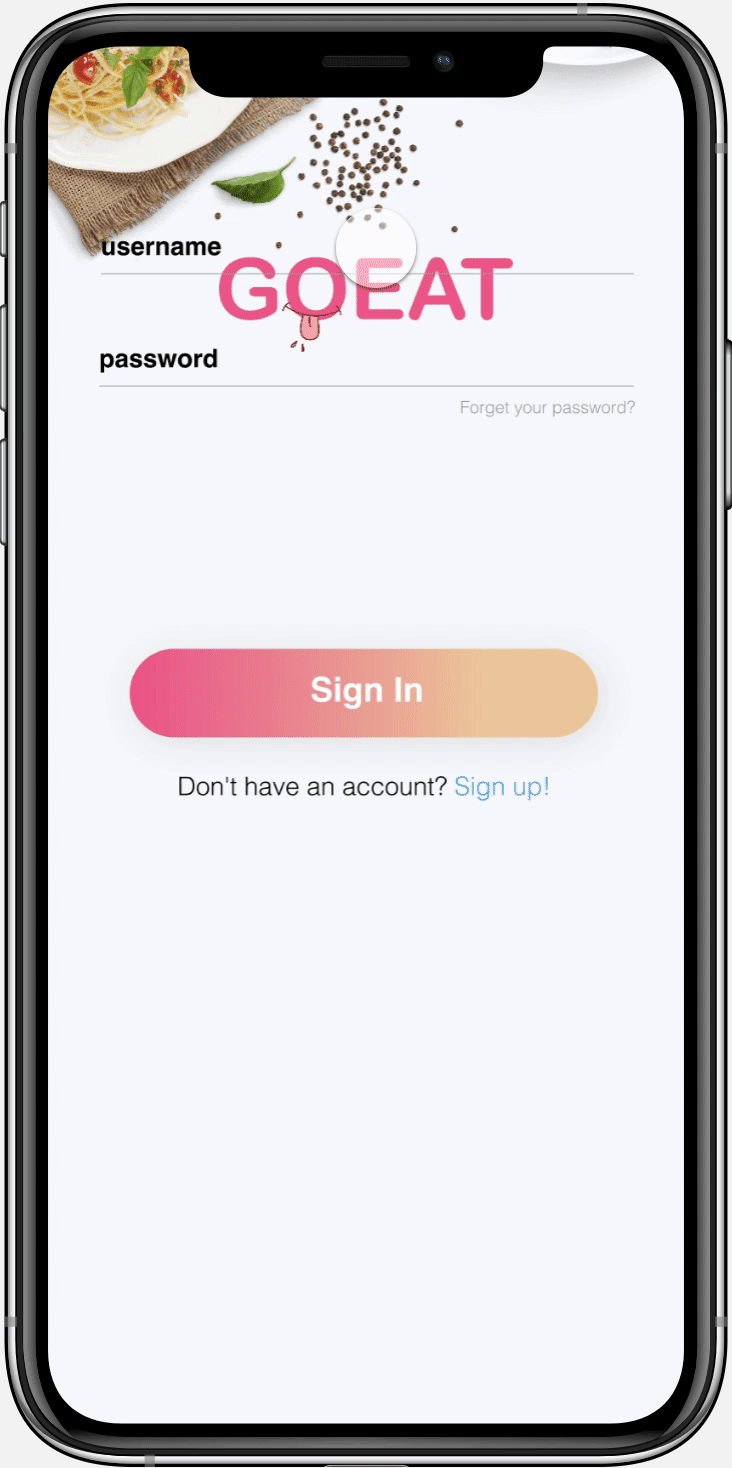
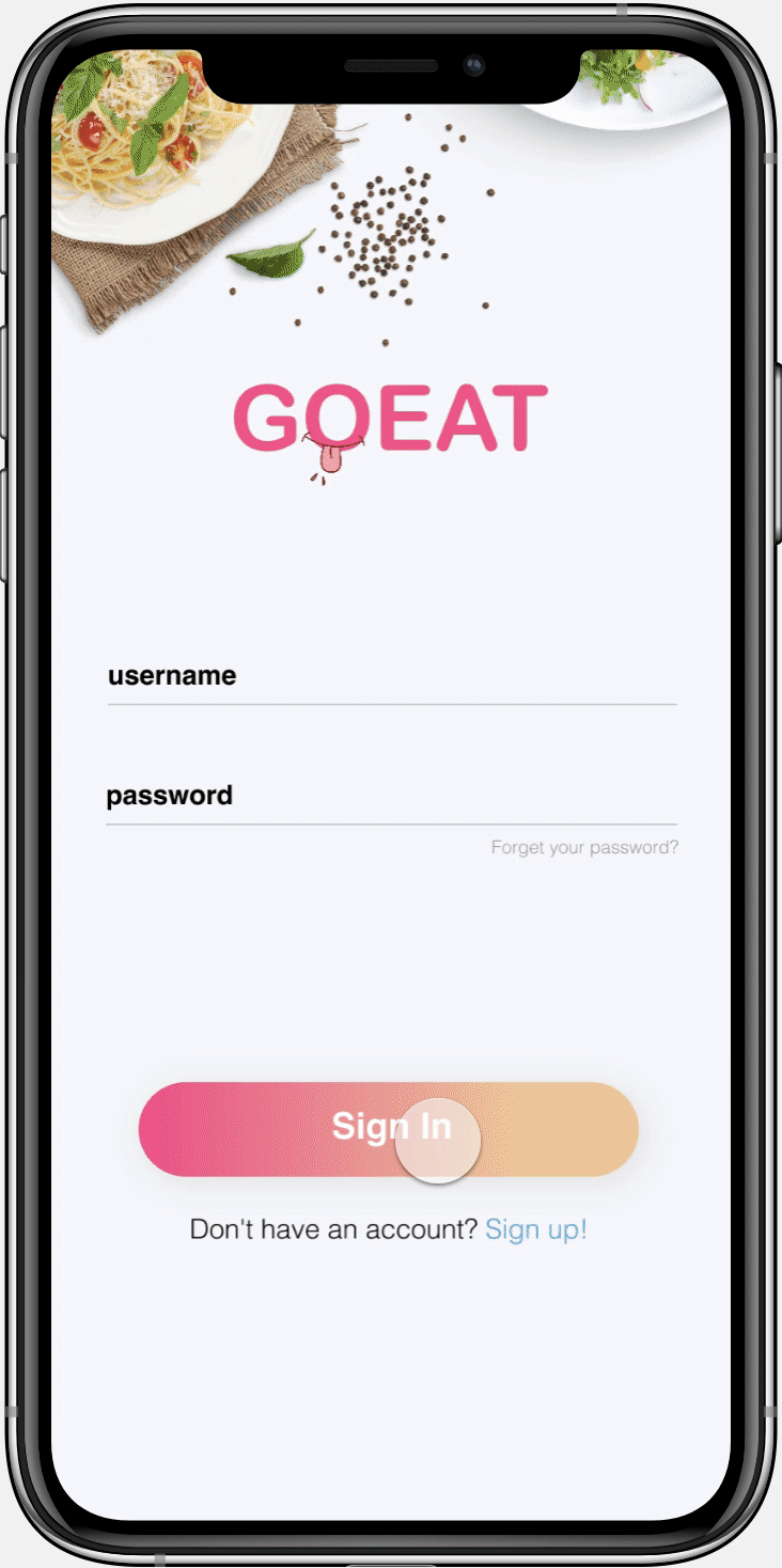
Sign - up for having an account
In order to start searching for restaurants, users need to sign-up first by inputing their user name, passwords first. Then the system would require personal information from them including avatar, sex and their personal tastes. Finally, users could either input their payment information or not. After completing the process, they well be directed to home-page where they could see search engines, good deals for today and popular restaurants in case if they have no idea.
Sign - in for starting
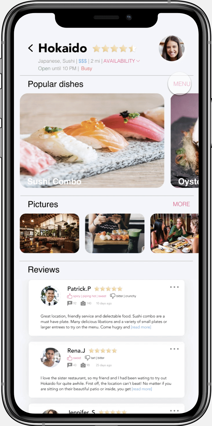
For users who already have an account, they could click sign-in button. Users will be directed to main page and start searching. There are different ways for helping them filter through the restaurants including: ranks, distance, price, cuisine or they could input the restaurants' name if they already know what they're craving for! By clicking the restaurant's panel, they could get more information such as menu, reviews for restaurants and their popular dishes...
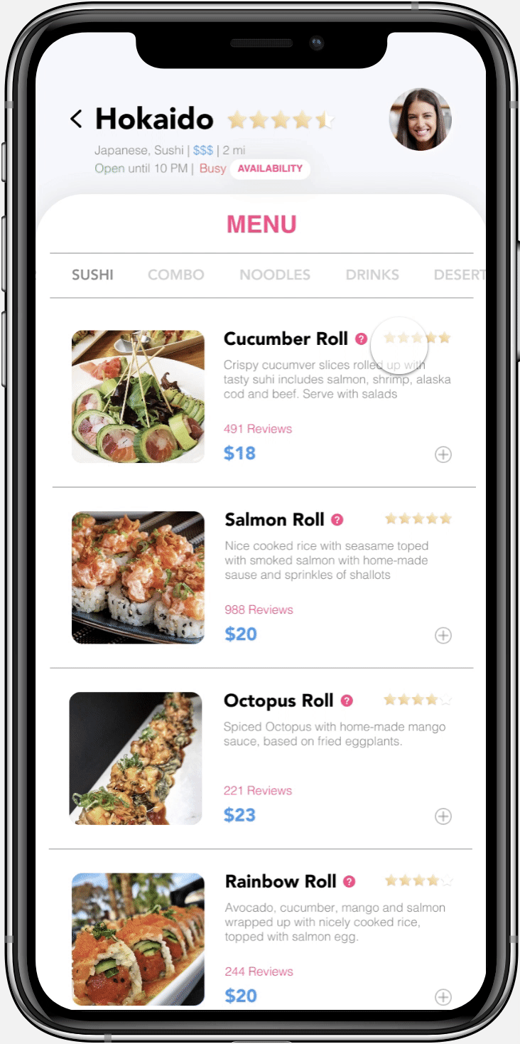
Exploring the menu
By clicking the menu button on the right side of the popular dishes, users could get more information about each dish, such as description, reviews, price. The review buttons allow users to see different comments for the same dish. Also, reviewers personal information such as taste preference, how many comments they gave are presented in order to help users make better decision.
Ordering foods
If users are not sure about the dish, they could click the "?" on the left side of every dish's name to ask questions. The AI machine would automatically reply their requests based on their questions. Once users are sure about the foods, they could start ordering by clicking "+" button, the cart buttons would pop up from the button to remind users how many items they've order and where to check.
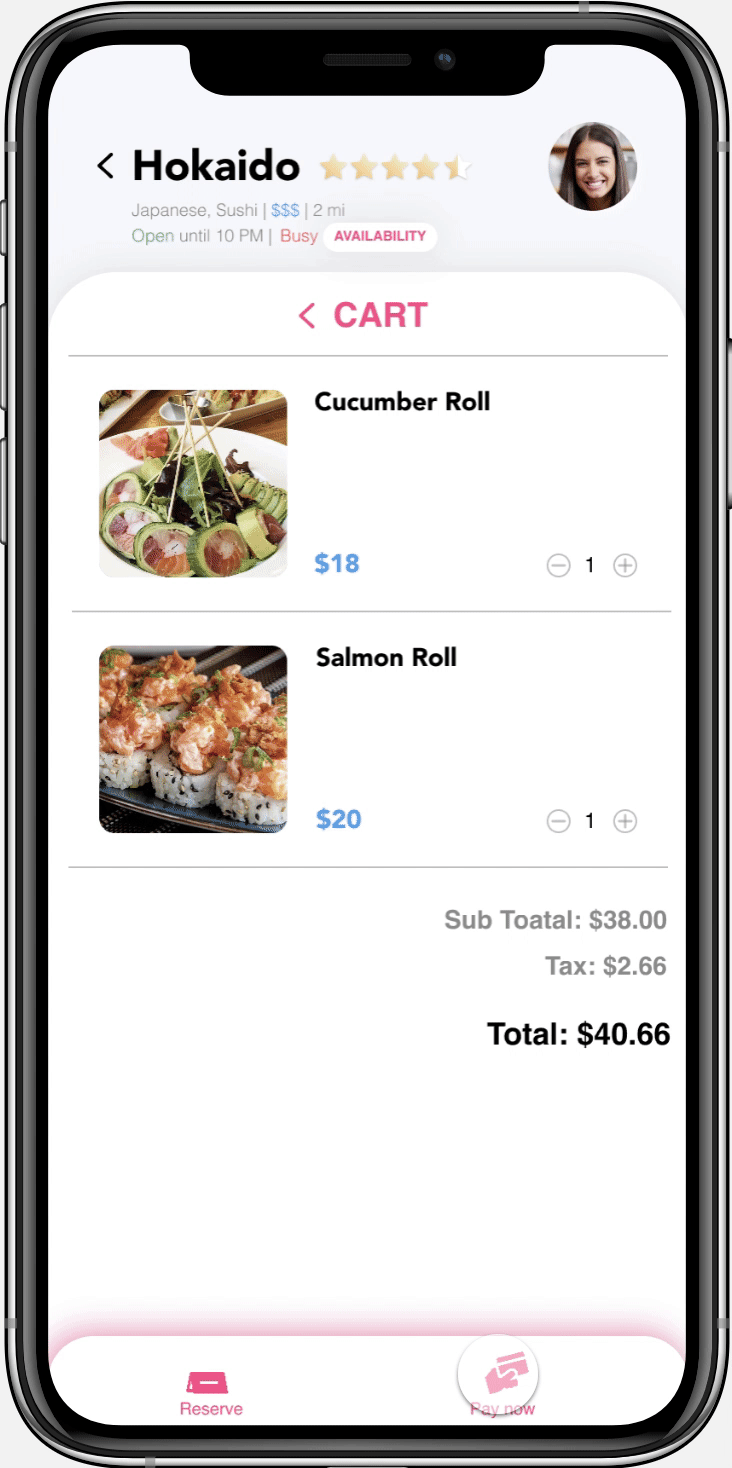
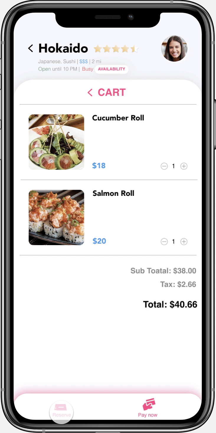
Pay for the bills and reserve table
Users could either chose to pay for the bills on the app or in the restaurants. But users need to reserve table to complete their orders by input the time they will be arriving and how many people they have, so the waiter/waitress could better prepare for them. Their order could be checked by clicking their own avatar. If anything happened, users could cancel the orders from here.
The difference between paid-meals and reserved meals is in their account, paid-meals have a receipt whereas reserved meals encourage users to pay.
Next Step
If I had more time, I would think & go further:
Post-dine-out experience
Currently, the app focused on pre-dine-out experience and hasn't included pos-dine-out function which is to write reviews for the restaurants. Since writing the reviews require some times and not lots of users would like to do that, but it's important for the restaurants to improve and for other users to make decisions. How can I do to encourage users to write reviews and make this experience better?
Pay for the tips
I would like to conduct research about whether users would like to pay the tips using the paper receipt their waiter/waitress bring them or they prefer to pay by the apps. If it's the later, how can I incorporate this function and how does it work?
More case studies


Converse
Optimizing Converse custom shoppers' experience, enhancing overall product list page(PLP) and product detail page (PDP) features.
UX/UI Design, User Research, Front-end Development
TraveLog
Designed an app helps you record travel footprints, share your experience and connect with the world.
UX/UI Design, UX Research, Prototyping


Children's Museum Accessibility
Conducted research across 309 native children's museums to uncover missing accessibility information, and make actionable recommendations
Conducted research across 309 native children's museums to uncover missing accessibility information, and make actionable recommendations
User Research, Data Analysis


Children's Museum Indianapolis
Conducted an accessibility study aimed at improving museum experiences for adults and children with sensory sensitivities.
UX/UI Design, UX Research, Prototyping


FitBud
Designed an app assist you find desired workout mates, schedule workout date, and keep in touch
UX/UI Design, User Research, Prototyping


Fitness Wearable Device
UX Research: Improve auditory feedbacks from wearable device
2017.8
CHI2018
CHI2018

CHI2018
Fitness Wearable Device
Conducted user research to improve auditory feedbacks from wearable device, made actionable design recommendations.
UX Research, Data Analysis
bottom of page